8pt Magic number used by UI designers
Anyone who is a UI Designer or User Experience Designer should be used to the rules of the 8pt Layout Grid System,
As it allows designers to lay out the structures better and systematically with spacing.
What is an 8pt Layout Grid System?
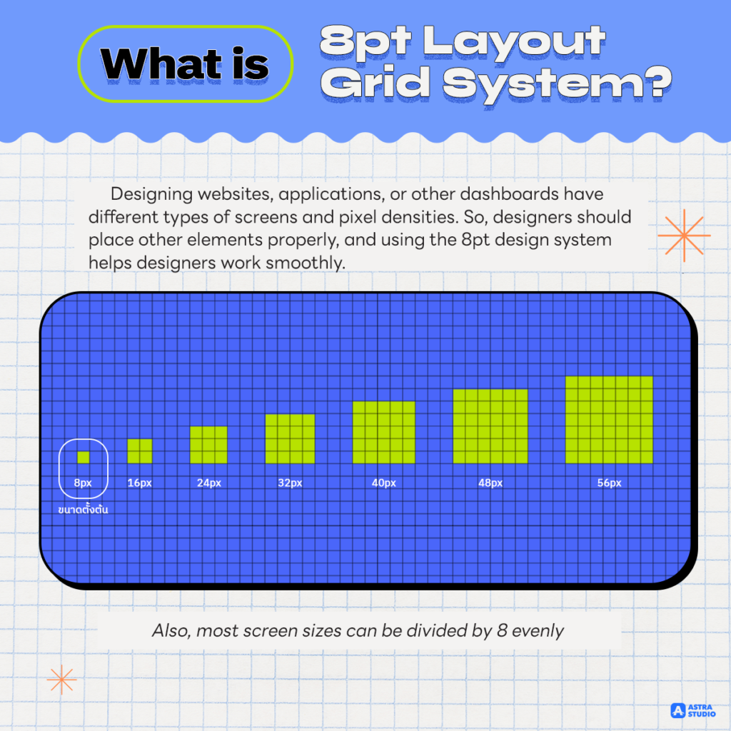
Designing websites, applications, or other dashboards have different types of screens and pixel densities. So, designers should place other elements properly, and using the 8pt design system helps designers work smoothly. Also, most screen sizes can be divided by 8 evenly, and this makes it easier if we apply the principle of 8pt Grid; use multiples of 8 (8, 16, 24, 32, 40, 48, 56, etc.) in layout, size, space, and other parts of the elements.
Plus, they’re easy to remember for division, and there is no annoying .5 remainder. For example, if it’s 10, you will end up with 5px, 2.5px, and 1.25px, respectively. Thus, avoid using half pixels as much as possible will make it easier to work.
Is spacing necessary?
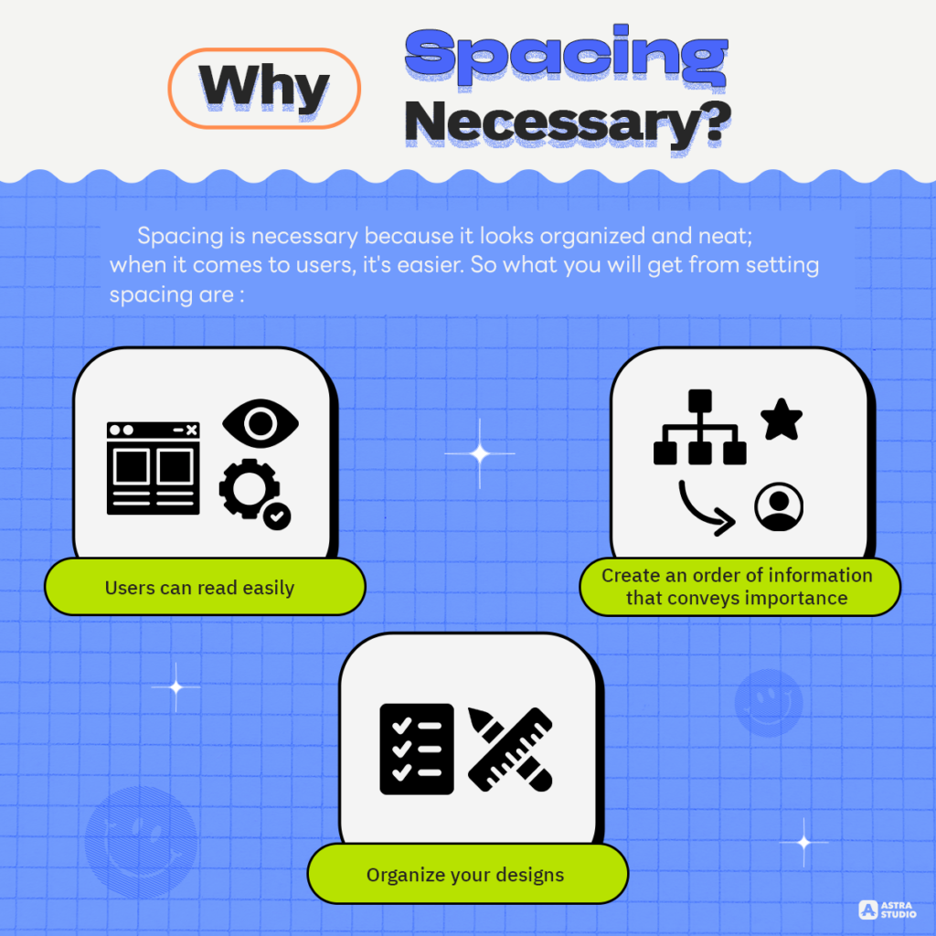
Spacing is necessary because it looks organized and neat; when it comes to users, it’s easier. So what you will get from setting spacing are:
- Users can read easily
- Create an order of information that conveys importance to users
- Organize your designs
Sizing
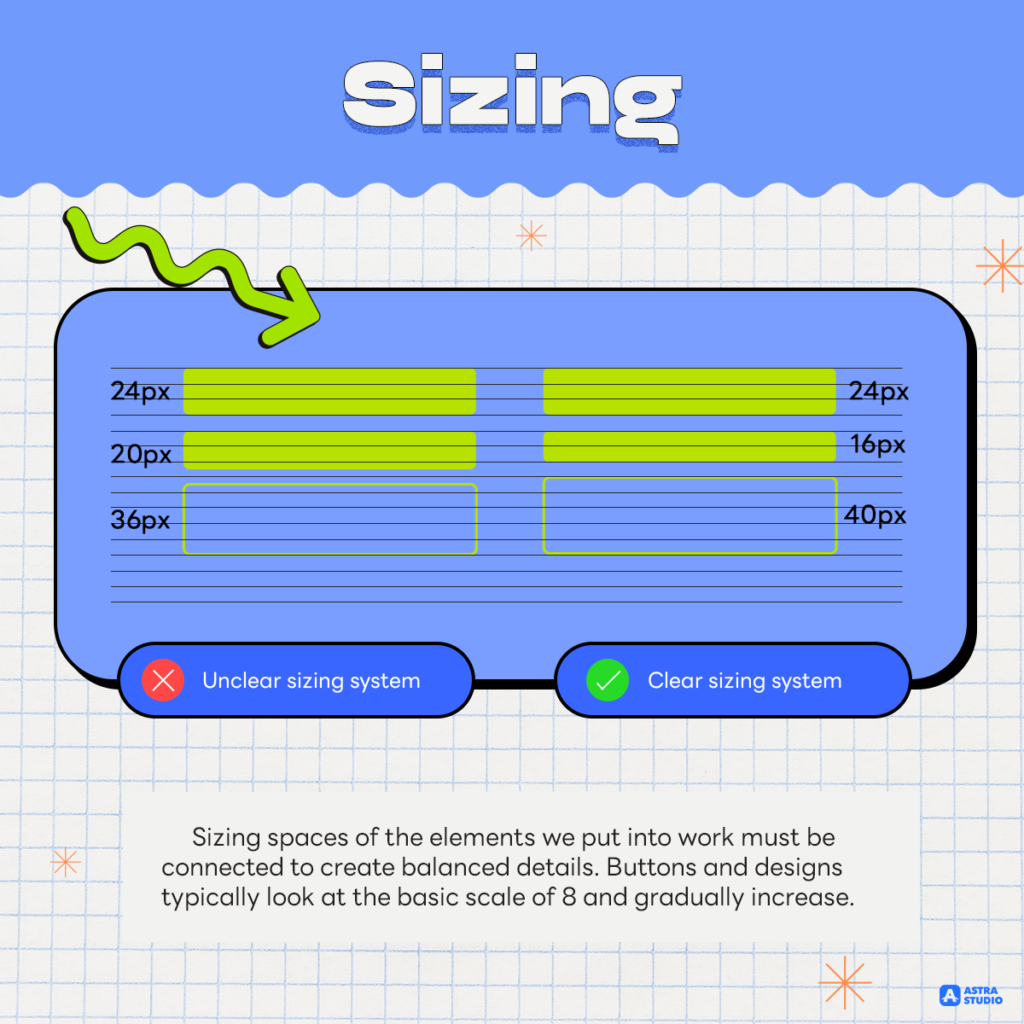
Sizing spaces of the elements we put into work must be connected to create balanced details. Buttons and designs typically look at the basic scale of 8 and gradually increase. It allows a clear structure, scale, and meter in your design. These elements can also be applied to the line heights, buttons, and inputs. Again, size is a key element in getting your project to perfection.
Padding
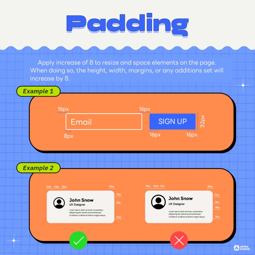
UI designers must consider padding to balance the content. Not only for the looks but also to make it easier for users to read. The size of buttons and spaced areas can be used with the original form by measuring from (8, 16, 24, 48).
Example:
Apply increase of 8 to resize and space elements on the page. When doing so, the height, width, margins, or any additions set will increase by 8.
Text spacing
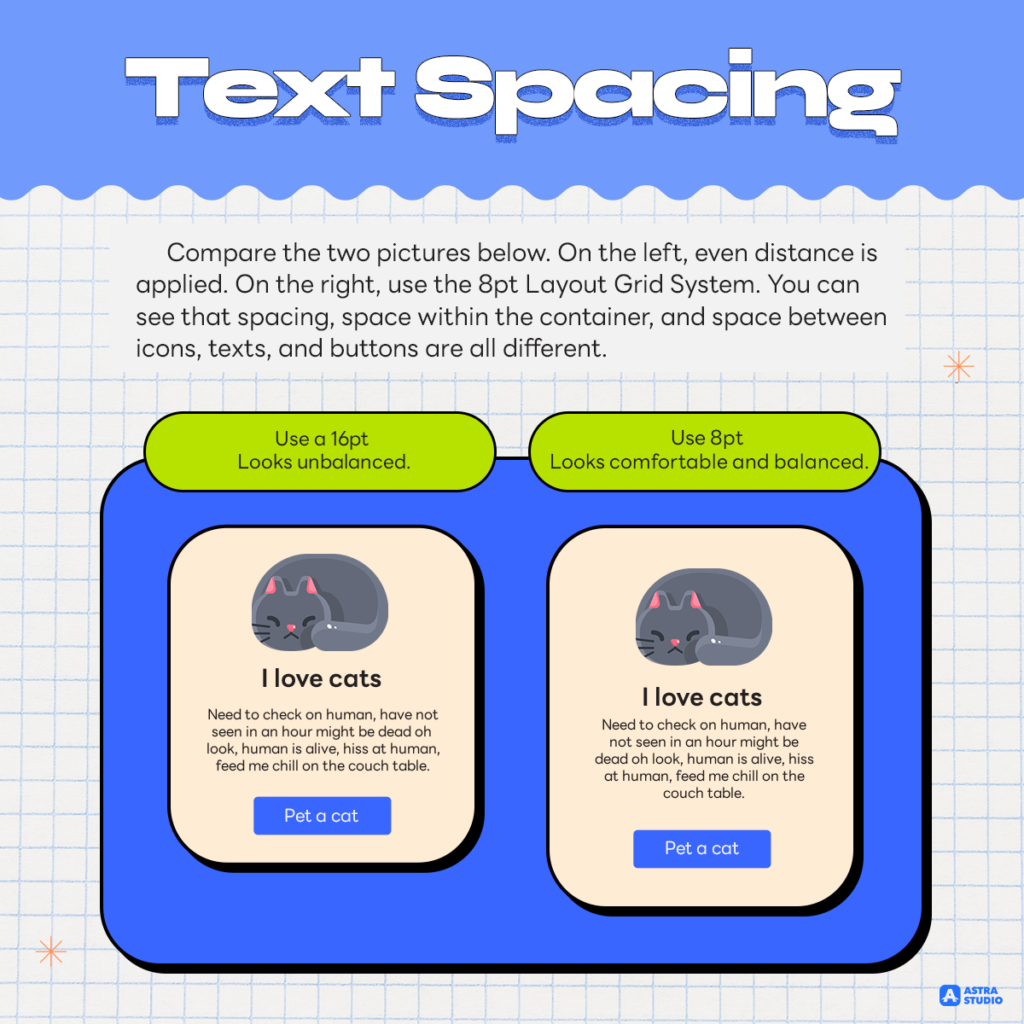
Compare the two pictures below. On the left, even distance is applied. On the right, use the 8pt Layout Grid System. You can see that spacing, space within the container, and space between icons, texts, and buttons are all different.
See how the picture on the left looks floating and disorganized? But the picture on the right seems balanced and neat.
Distance and icons
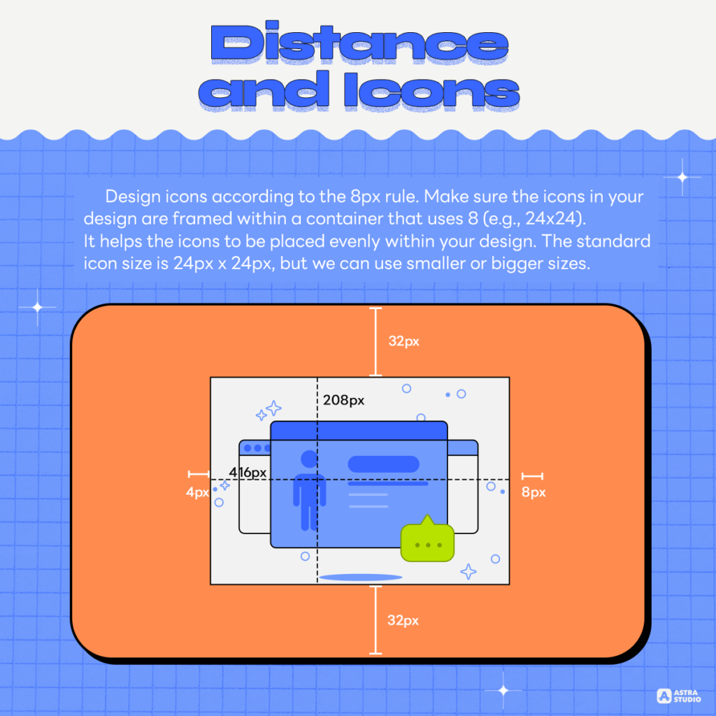
Design icons according to the 8px rule. Make sure the icons in your design are framed within a container that uses 8 (e.g., 24×24). It helps the icons to be placed evenly within your design. The standard icon size is 24px x 24px, but we can use smaller or bigger sizes.
Here are some samples:
https://spectrum.adobe.com/page/responsive-grid/
We hope this article may help many UI designers apply this theory to their work for tidy, organized, and consistent results. Try the 8px spacing method, and your designs will look much better.
If anyone is interested in creating a professional website, Astra Studio, we have a team of experts to advise and consult every step of the way to make your work come out the best.
Please make sure you do not miss any updated news by following our social media as follows:
Contact Us: Contact us
Medium: Medium Astra Studio
Website: Astra Studio