8 Professional designs for UX/UI Button
“Button” is an interactive trait that directly affects users, used to “record.” It is also one of the most critical interactive elements of an application.
These buttons can lead to purchases, downloads, delivery, and other important actions. These digital buttons are the ones in the real world we use, for example, TV remote controls, record players, or game controllers.
The most important thing!
The button should look like a button.
The buttons’ designs should be outstanding to be distinct from the screen.
5 Ways to Make Beautiful Fonts for UI Design
Familiarity = good
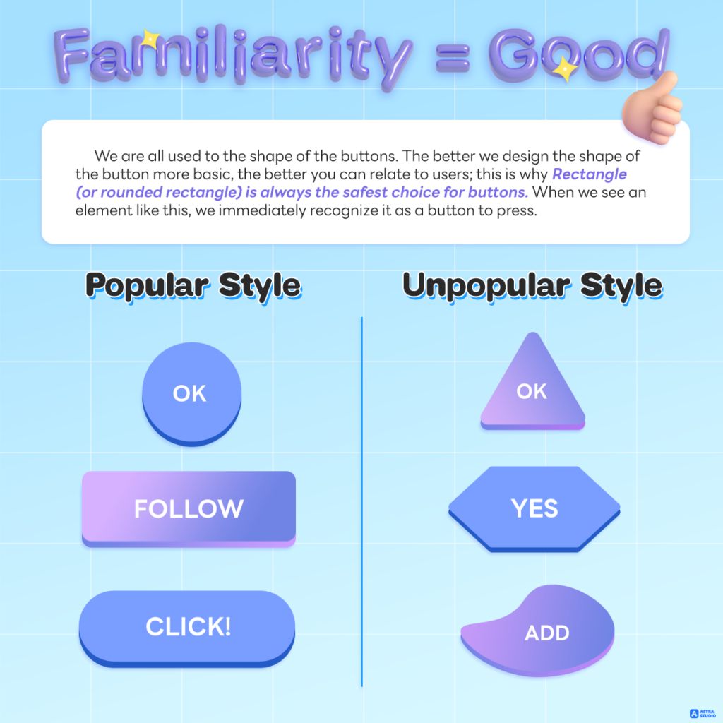
We are all used to the shape of the buttons. The better we design the shape of the button more basic, the better you can relate to users; this is why rectangle (or rounded rectangle) is always the safest choice for buttons. When we see an element like this, we immediately recognize it as a button to press.
Besides the rectangle, we should be aware when using other formats. Because nowadays, round buttons are also gaining popularity. But if it is another shape, such as a triangle, that may not be widely used, that can confuse the users.
Button Dissection
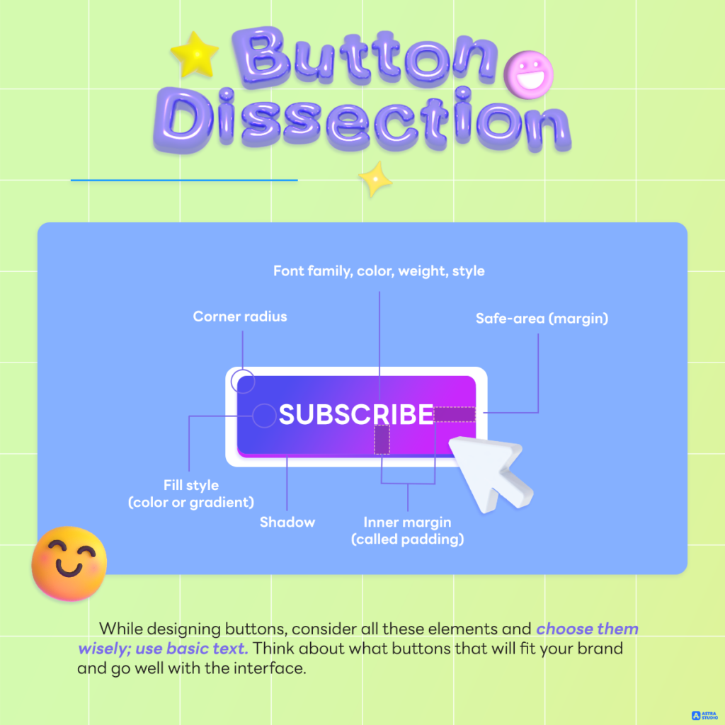
While UX/UI designing buttons, consider all these elements and choose them wisely; use basic text. Think about what buttons that will fit your brand and go well with the interface.
Consider padding and space settings. For example, the left internal distance is twice as large due to the vertical spacing, which is a safe option for raised readability.
Spacing and alignment
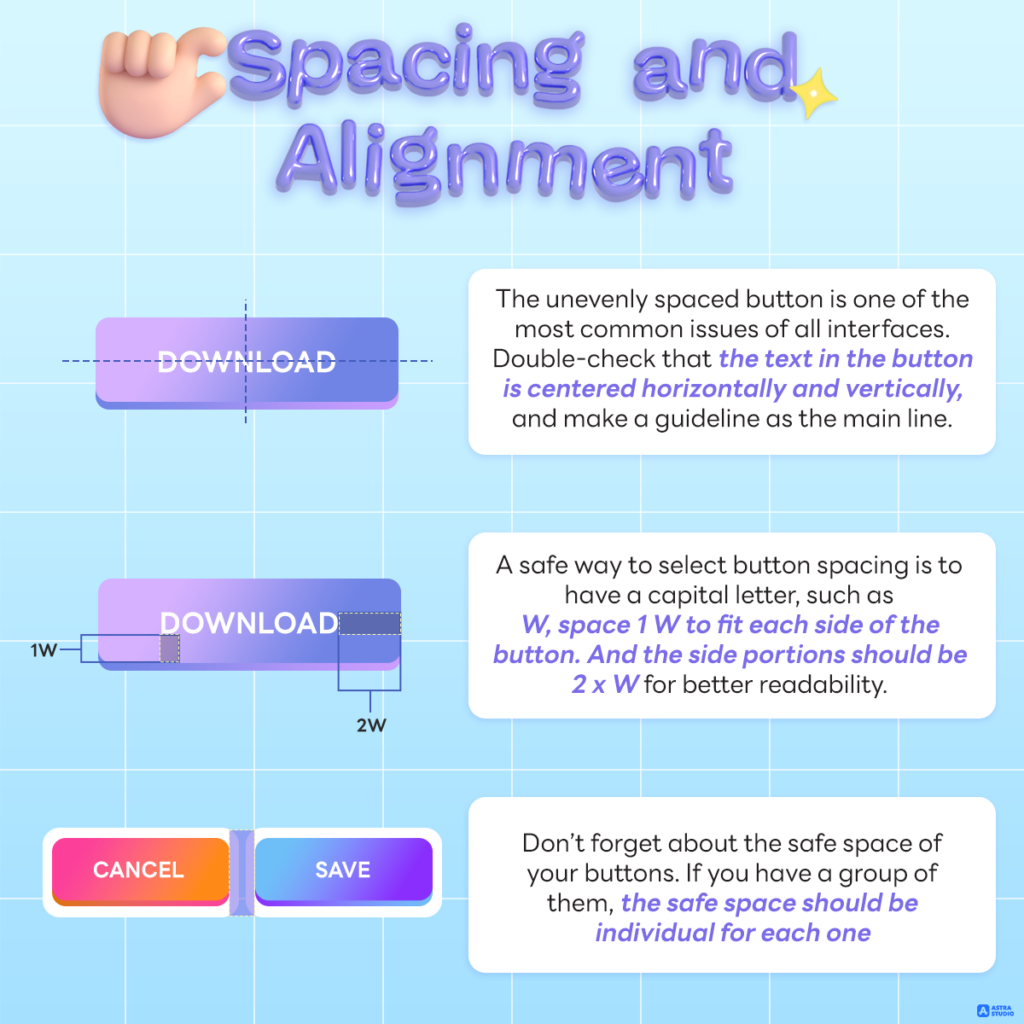
The unevenly spaced button is one of the most common issues of all interfaces. Double-check that the text in the button is centered horizontally and vertically, and make a guideline as the main line.
Other than the table method, a safe way to select button spacing is to have a capital letter, such as W, space 1 W to fit each side of the button. And the side portions should be 2 x W for better readability.
Suitable size
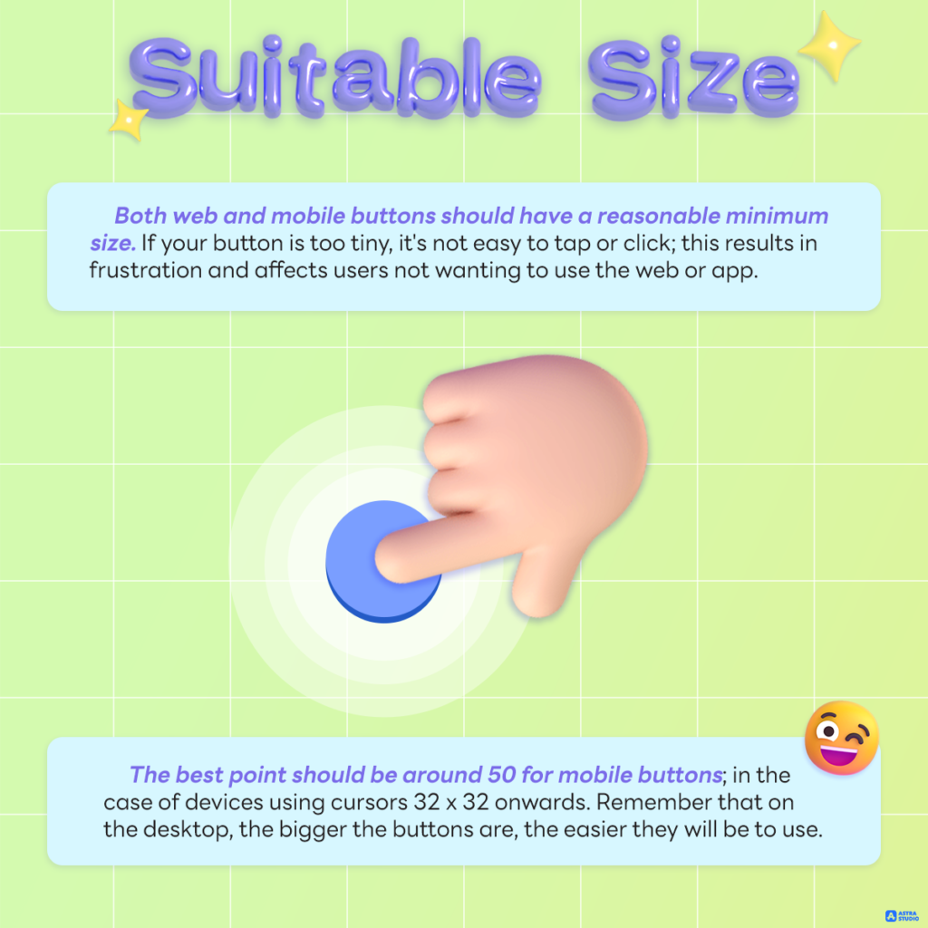
Both web and mobile buttons should have a reasonable minimum size. If your button is too tiny, it’s not easy to tap or click; this results in frustration and affects users not wanting to use the web or app. The best way is to start with 44 by 44 points for all interactive elements on mobile devices.
The best point should be around 50 for mobile buttons; in the case of devices using cursors 32 x 32 onwards. Remember that on the desktop, the bigger the buttons are, the easier they will be to use.
Attraction
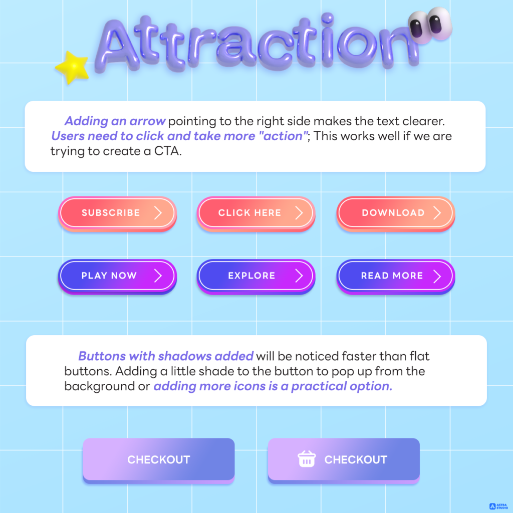
Adding an arrow pointing to the right side makes the text clearer. Users need to click and take more “action”; This works well if we are trying to create a CTA.
Buttons with shadows added will be noticed faster than flat buttons. Adding a little shade to the button to pop up from the background or adding more icons is a practical option.
Rounded corner
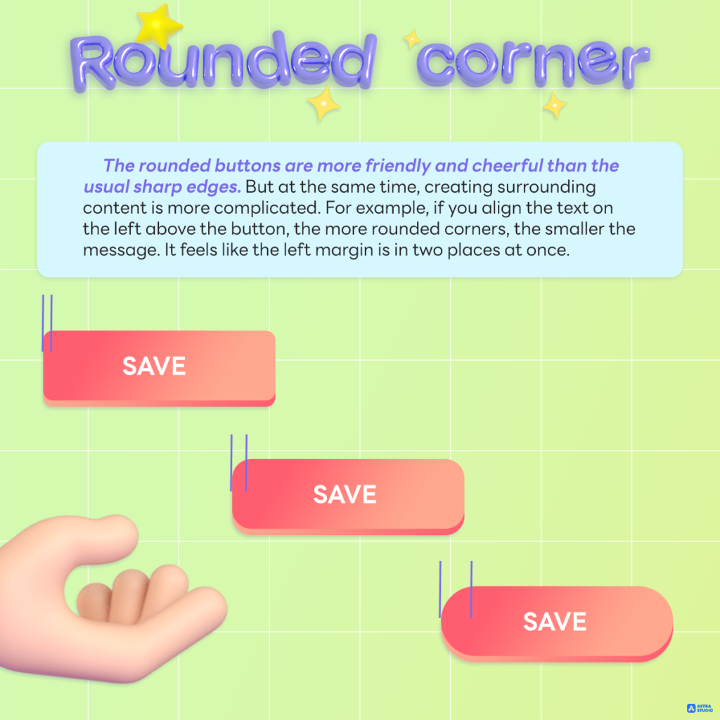
The rounded buttons are more friendly and cheerful than the usual sharp edges. But at the same time, creating surrounding content is more complicated. For example, if you align the text on the left above the button, the more rounded corners, the smaller the message. It feels like the left margin is in two places at once.
Icon alignment
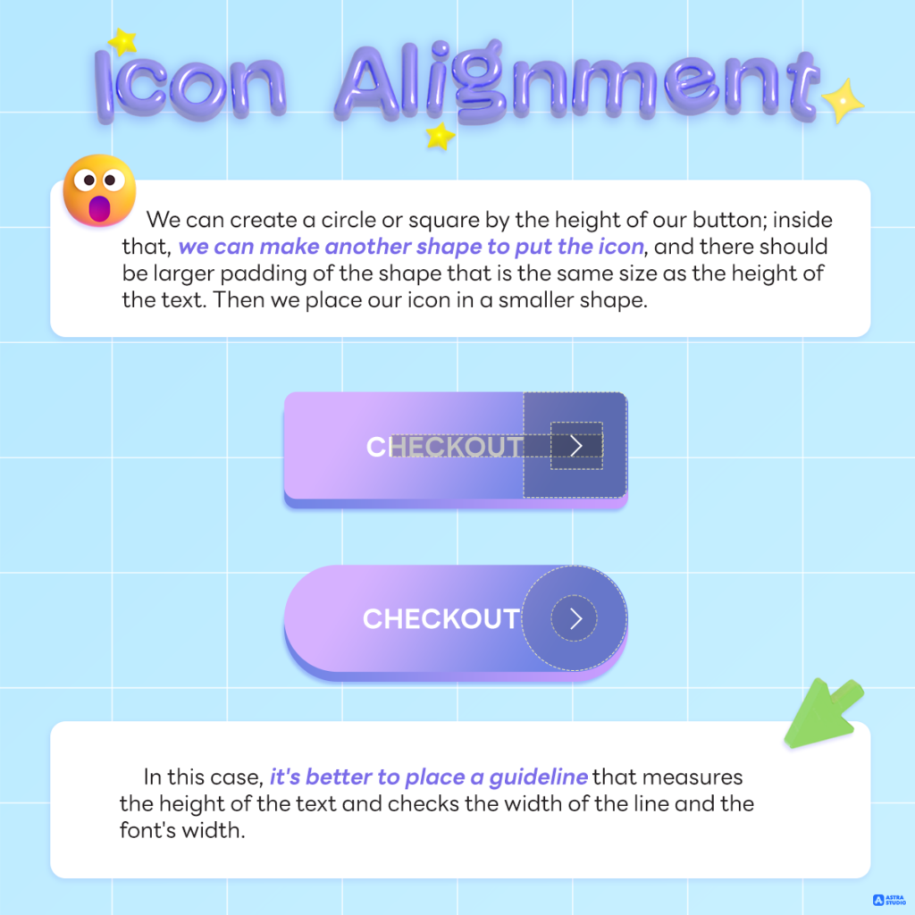
Getting good icon placement on the button is the hardest thing to do. In many cases, the link between font and icon weight connects directly and particularly. However, there are some simple and applicable rules.
We can create a circle or square by the height of our button; inside that, we can make another shape to put the icon, and there should be larger padding of the shape that is the same size as the height of the text. Then we place our icon in a smaller shape.
In this case, it’s better to place a guideline that measures the height of the text and checks the width of the line and the font’s width.
Edge balance
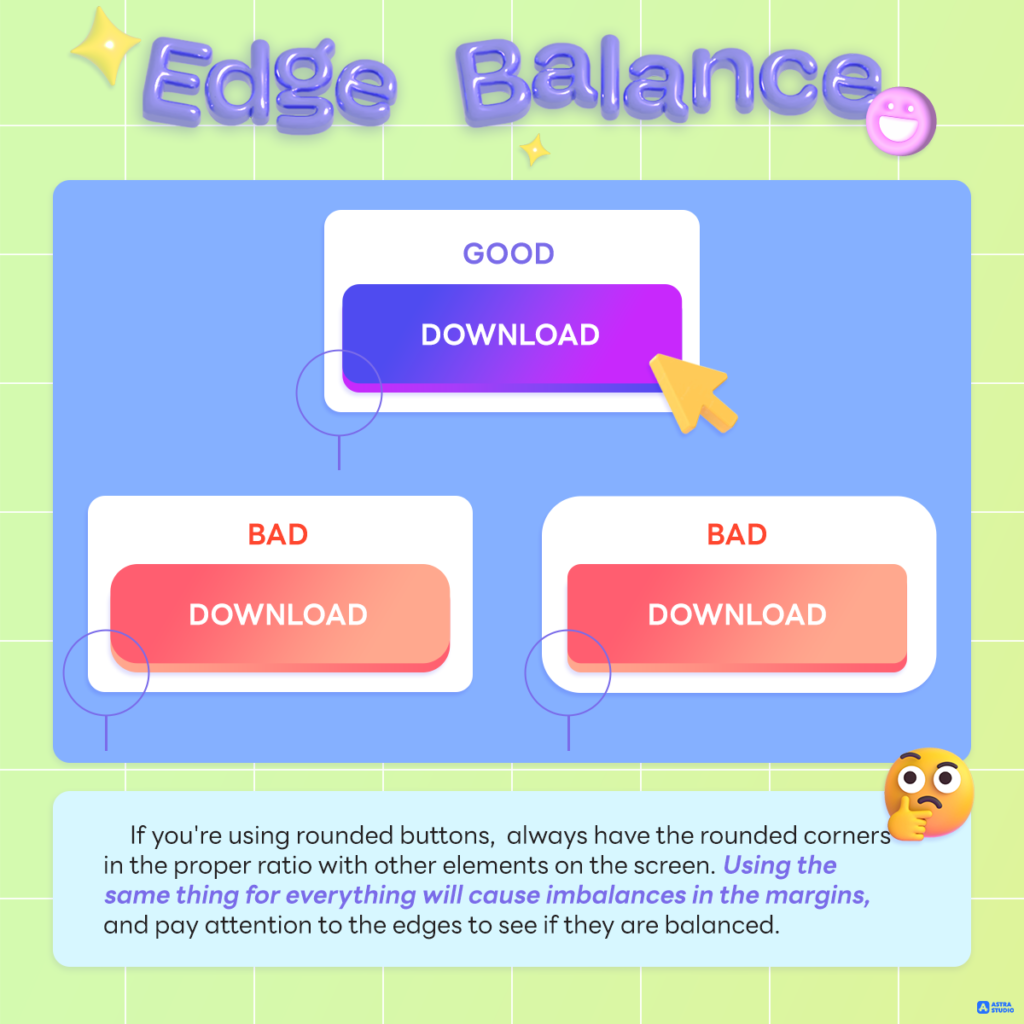
If you’re using rounded buttons, always have the rounded corners in the proper ratio with other elements on the screen. Using the same thing for everything will cause imbalances in the margins, and pay attention to the edges to see if they are balanced.
To sum up!
As you begin creating primary, secondary, and third buttons, remember to check with a few factors every time. Even a slight inconsistency or misalignment can lead to lower conversions. And with that, converting buttons and clicks is vital.
Please note that:
- Make your button look like a button
- Center the label vertically and horizontally
- Enough space (padding) inside the button
- If you use the icon, choose the right size and alignment
- Set your border radius depending on where the button will be used and check if the radius matches other on-screen elements
- Make it the right size! The bigger the button, the easier it is to use. That includes the desktop too!
If anyone is interested in making a website or developing applications, you can apply for the services of Astra Studio. We have specialists to give advice and guidance at every step, from start to finish. We guarantee the perfect results.
Please make sure you do not miss any updated news by following our social media as follows:
Contact Us: Contact us
Medium: Medium Astra Studio
Website: Astra Studio